A black and grey realism tattoo can look extraordinary in a close-up photograph and still fail as a body composition if the reference, size, contrast or placement is wrong.
Realism is not simply “more detail.” It is the careful selection of detail. The face, animal, object or scene needs a clear focal point, readable shadows and enough space to remain understandable when you are not viewing it through a zoomed phone screen.
This guide uses four distinct pieces of real Apex Tattooz work to explain the seven decisions that matter before you approve a black and grey realism design.
Before you book: do not judge the idea only by how impressive the reference looks. Ask whether the source is clear, whether the body area provides enough room and whether the design still reads from a normal distance.
Four real examples, four different realism problems
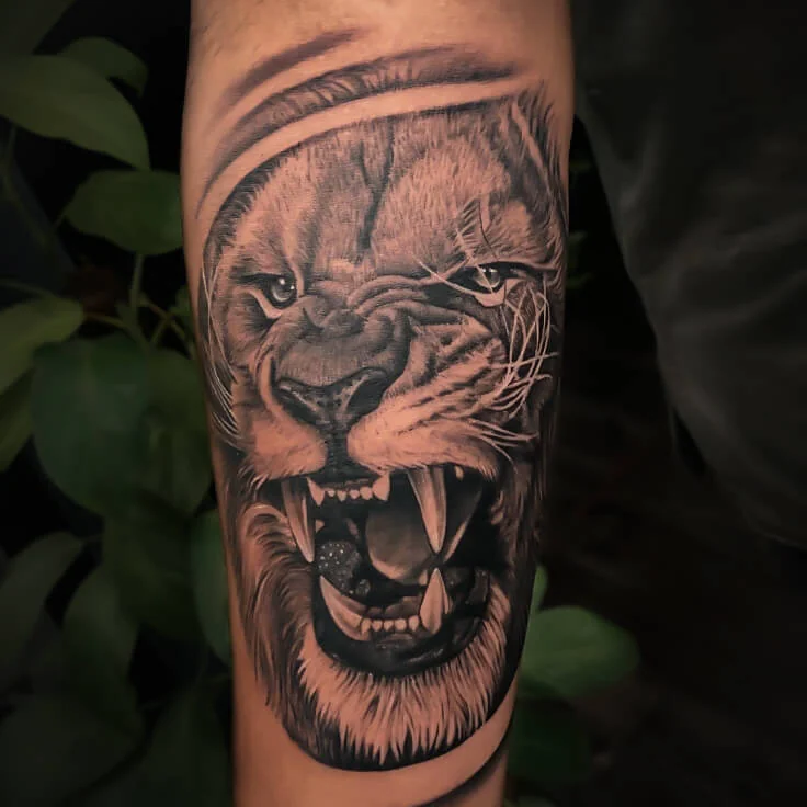
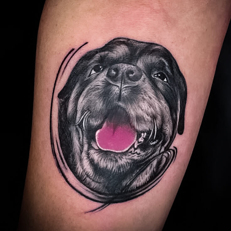
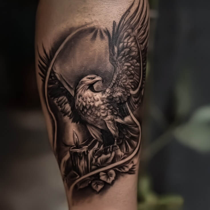
Realism is not one fixed formula. A pet portrait depends on expression and recognisable features. A bird design depends on feather separation and movement. A lion needs facial structure, fur direction and controlled darkness. A warrior composition needs strong silhouette, hierarchy and separation between the person and the headdress.
The examples below show why the planning method must respond to the subject instead of applying the same contrast and detail everywhere.
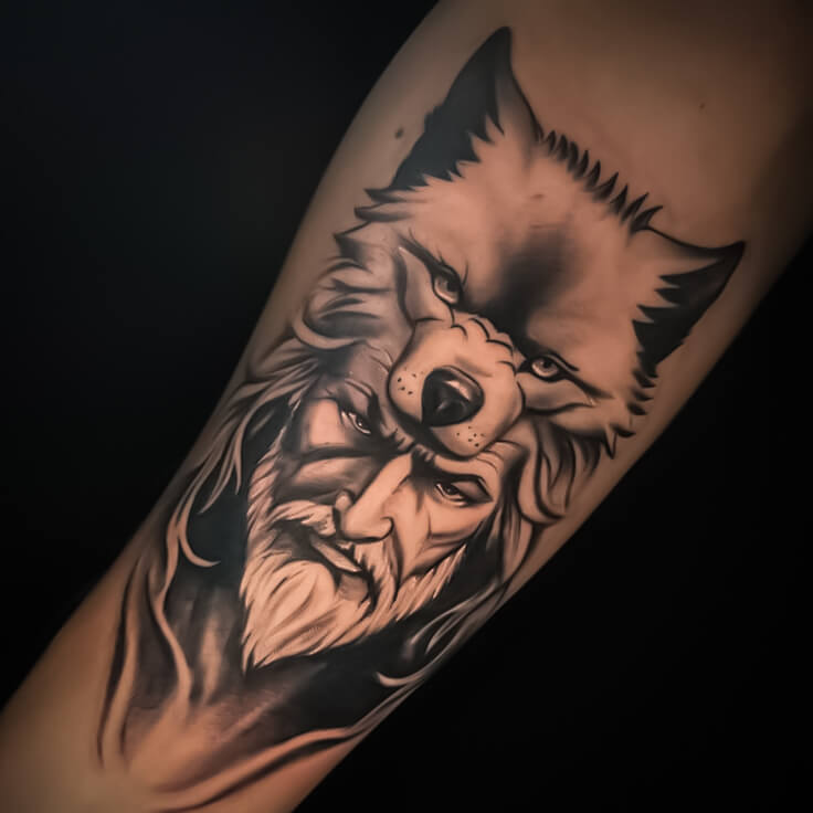
1. Start with a reference that contains real information
A realism tattoo can only be planned honestly from the information available in the reference. A blurred screenshot, heavily filtered face or tiny subject inside a group photograph may hide the features that make the subject recognisable.
A strong primary reference usually provides:
- clear eyes, facial structure or defining subject details;
- usable light and shadow rather than crushed darkness;
- a natural angle that suits the planned placement;
- enough resolution to understand edges and texture;
- an expression or moment that carries the intended feeling.
Send the original file whenever possible. Repeated screenshots and messaging compression remove subtle detail. If the subject is a person or pet, a few supporting photographs may explain hidden features, but one image should normally establish the main angle and expression.
For portrait-specific preparation, read the portrait tattoo from a photo guide.
2. Decide what the viewer should notice first
A successful realism piece has a visual order. The eye may go first to the animal’s face, the warrior’s expression or the bird’s wings. Secondary elements can support that subject, but they should not demand equal attention.
Before approving the design, reduce it to one sentence: “The first thing I want people to notice is…” If the answer contains four or five competing subjects, the design may need simplification or more space.
Background smoke, architecture, clocks, flowers, lettering and geometric shapes can create atmosphere. They should never be added only because a gap exists on the screen. Empty skin can be an active part of the composition.
3. Give the important detail enough size
Size is not about making every tattoo large. It is about giving the chosen detail enough physical room.
A realistic eye contains an eyelid, pupil, catchlight and surrounding shadow. Fur needs separation between dark masses and lighter strands. A face needs readable relationships between the eyes, nose, mouth and hairline. When these features are compressed too aggressively, they can merge visually.
The minimum sensible size changes with the reference, subject, body area and level of background detail. Measure the actual placement before finalising the artwork. A design that looks balanced on one forearm may need a different crop or scale on another.
4. Build contrast instead of making everything dark
Black and grey realism depends on a range of values: strong darks, middle tones, soft transitions and open highlights. If every area is pushed to the same darkness, the focal point can disappear.
The roaring lion Featured Image uses strong dark areas around the mouth and facial structure while lighter skin and softer transitions preserve separation. The dog portrait uses a small colour accent, but the expression remains readable because the black-and-grey structure works first.
Ask to view the design at normal size, not only as a zoomed digital file. The main silhouette and expression should remain clear from a realistic viewing distance.
5. Match texture to the subject
Fur, feathers, skin, metal, cloth and smoke should not be shaded identically. Texture is communicated through the direction, density and edge quality of the marks.
- Fur: group the main dark and light masses before adding individual strands.
- Feathers: show the layered structure and direction of the wing rather than drawing every feather with equal weight.
- Faces: protect proportions and transitions; random texture cannot repair incorrect structure.
- Metal or armour: use controlled highlights and sharper edges to separate it from skin or fabric.
- Smoke and background: keep it supportive so it does not erase the subject’s outline.
Detailed does not mean uniformly busy. The strongest texture often appears beside a quieter area that allows it to be seen.
6. Design for the curve and movement of the body
The body is not a flat print. Forearms taper, upper arms rotate, calves curve and shoulders change shape when the arm moves.
A placement test should check the artwork with the body relaxed and from more than one angle. Important eyes or facial features should not disappear around an edge. Long straight elements should be adapted so they do not look unintentionally bent from the main viewing position.
Vertical subjects often suit the forearm or calf, while broader compositions may need the upper arm, thigh, chest or back. The correct placement depends on the exact crop and detail—not only on the subject name.
7. Simplify the background before it steals the result
People often arrive with a strong main subject and then keep adding clocks, roses, text, maps, eyes or smoke. Each addition can be meaningful, but every element uses space and contrast.
Use this decision test:
- Does the element have a genuine connection to the idea?
- Does it improve the body flow?
- Can it remain secondary to the focal subject?
- Would removing it make the composition clearer?
A custom design should feel complete, not crowded. Learn how Apex approaches original compositions on the custom tattoos in Delhi page.
Black and grey or selective colour?
Black and grey can create a cohesive, focused result. Selective colour can be useful when one detail has genuine importance, but it should be planned as part of the hierarchy rather than added at the end.
In the dog portrait, the tongue introduces colour while the face remains anchored by black-and-grey structure. That approach is different from a full colour-realism composition, where the entire value and colour balance must be planned together.
Neither option is automatically better. The reference quality, skin, placement, surrounding tattoos and desired mood should guide the decision.
What affects the price of a realism tattoo?
The subject alone does not determine the price. A small simplified animal and a detailed multi-element sleeve are different projects even if both are described as realism.
The estimate normally depends on the planned size, level of detail, placement, design preparation, black-and-grey or colour direction and the practical scope of the work. Share the reference and body area before asking for a quote. The Apex Tattooz price guide explains these factors without reducing the decision to a misleading fixed figure.
Consultation checklist
- The original high-resolution reference
- Two or three supporting images when genuinely useful
- A clear photograph of the body placement
- The approximate size you are considering
- The single feature that matters most
- Any background element, text or symbol you consider essential
- Whether you prefer black-and-grey, selective colour or full colour
- Photographs of nearby tattoos that the new design must respect
You do not need to complete the composition alone. The purpose of the consultation is to identify what the reference can support, what the body area can carry and what should be simplified before the design is approved.
Plan your realism tattoo with Apex Tattooz
A realism tattoo should be built around the subject, your body and the way the piece will be viewed—not around a copied social-media image.
Bring the strongest reference you have and explain why it matters. Apex Tattooz can help you evaluate the focal point, size, contrast and placement before the artwork moves forward. Explore more real work in the gallery, start a tattoo consultation or use the studio guide for location and contact options.
Frequently asked questions
How small can a black and grey realism tattoo be?
There is no universal minimum. The sensible size depends on the subject, amount of detail, placement and contrast. Important facial or animal features need enough room to remain separate.
Can several references be combined?
They can support the brief, but one image should normally establish the main angle and expression. Combining unrelated light, proportions and perspectives without a clear hierarchy can weaken realism.
Does more detail always make the tattoo better?
No. Detail helps only when it remains readable and supports the focal point. Simplifying a background or texture can make the main subject stronger.
Can black and grey realism include one colour accent?
Yes, when the accent is planned and supports the hierarchy. The overall black-and-grey structure still needs to work without relying on the colour to create clarity.
What should I send for an estimate?
Send the reference, body placement, approximate size and preferred colour direction. Those details allow the scope to be discussed more honestly than the subject name alone.