Choose a tattoo palette by deciding what you want the colour to do. It might preserve the red of a favourite flower, make an animal’s markings part of the design, or draw attention to one detail. If shape, expression and the relationship between light and dark are what you love, black and grey may already give you the direction you want.
There is also a middle option: a largely black-and-grey composition with a deliberate colour accent. Before choosing between the three, give each one a job. “I like this blue framing the face” tells you more than “colour looks better.”
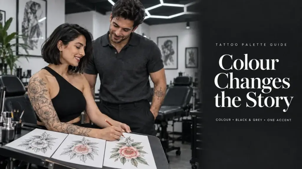
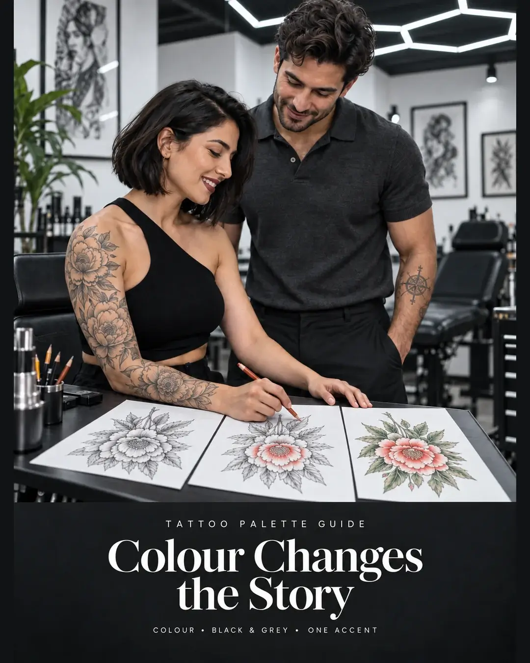
The cover and consultation illustration are AI-generated educational concepts. The three tattoo photographs are real Apex Tattooz portfolio work.
One botanical idea, three different priorities
Imagine a botanical tattoo with a flower, two leaves and a curved stem. You like the flower’s red petals, but also its silhouette. This is an illustrative design brief: the subject stays the same while you consider what matters most.
If the red petals are the reason you chose it
Colour belongs in the main idea. Describe the petal colour you want to discuss and its relationship to the leaves. A warm red flower against cooler foliage creates a different impression from a flower and leaves drawn from a quieter, closely related palette. Your useful question is which relationship you prefer. “Make it colourful” leaves that choice unresolved.
If you love the curve and layered petal shapes
Try describing those features without naming a hue: a curved stem, darker folds between petals, light edges and space around the leaves. That gives a black-and-grey direction something specific to preserve. You are choosing to express the flower through shape and tonal differences. The exact red would no longer be part of the result, so decide whether losing it changes the idea for you.
If one small detail should stand out
An accent approach could reserve colour for the flower while keeping the stem and leaves in black and grey. The coloured area would have a different visual role from the rest. Be clear about its extent: one petal, the whole flower and a coloured background are three different proposals.
The choice becomes easier when you finish this sentence: “The detail I would miss most if it changed is…” If your answer is the red, keep colour central to the discussion. If it is the silhouette, compare how each palette expresses that shape. If it is one focal detail, explore a restrained accent.
What three real Apex tattoos show
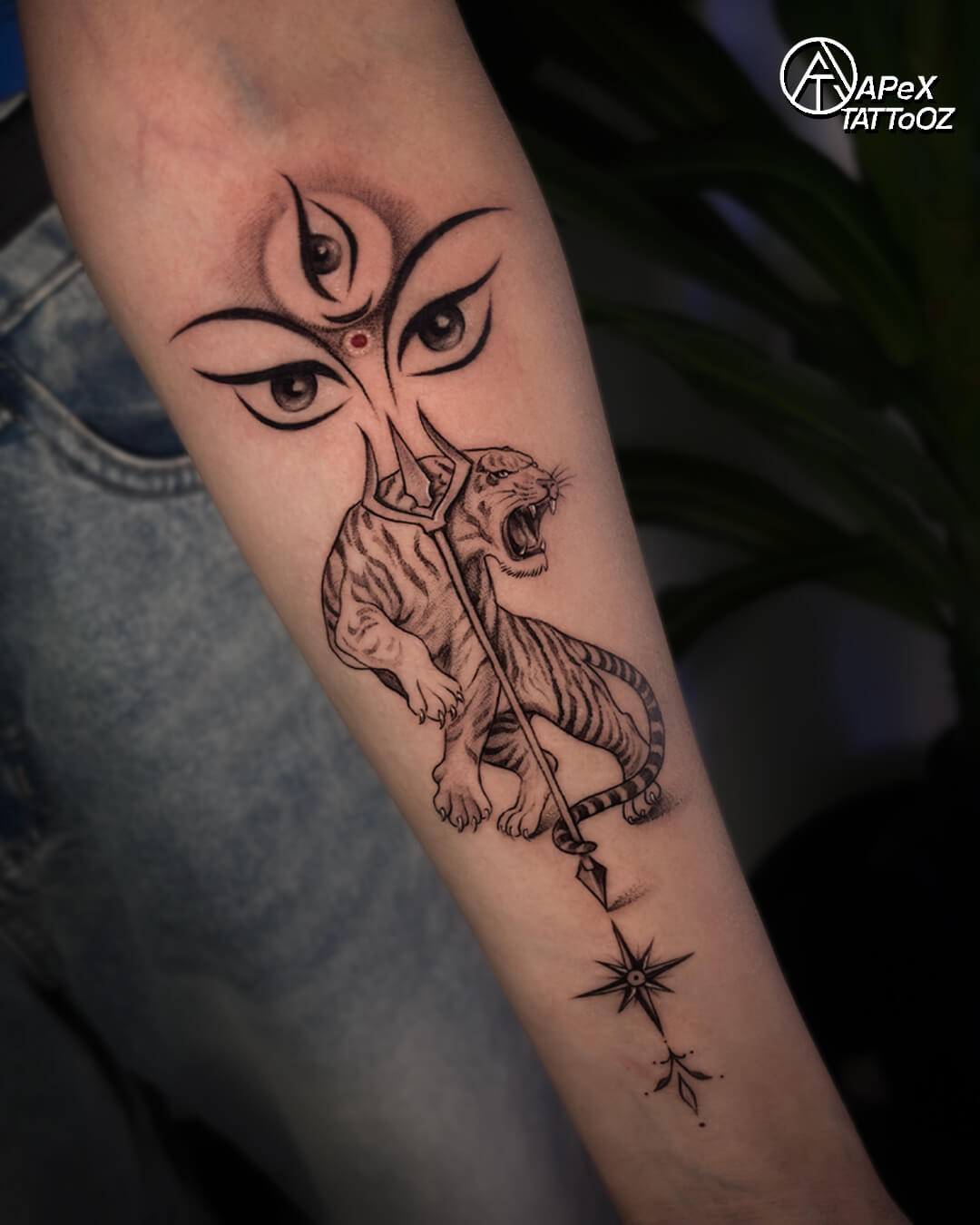
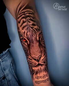
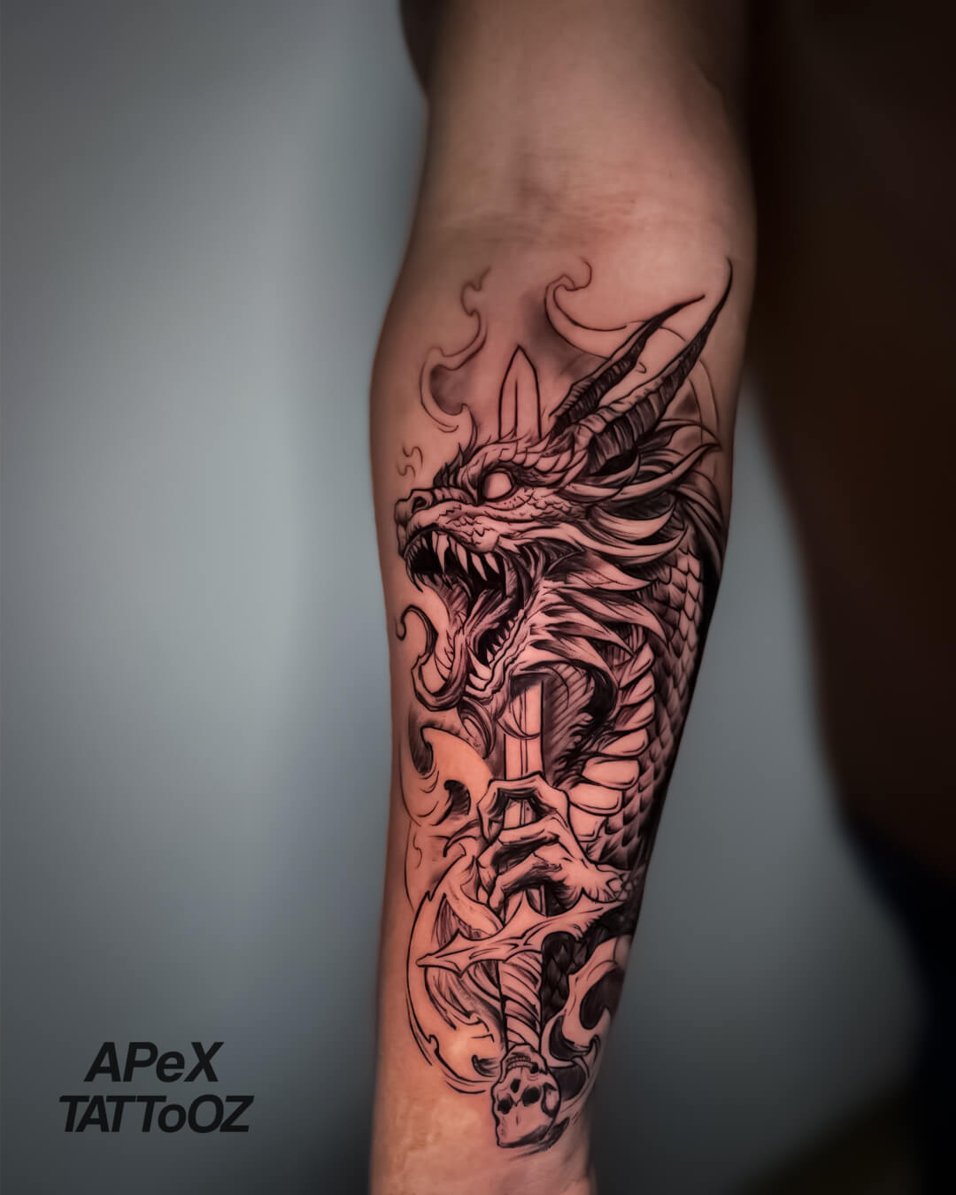
These are separate works, with different subjects and compositions. They help explain palette choices; they are not three versions of one design. Look at the part your eye notices first, then follow the surrounding shapes.
Colour can become part of the subject
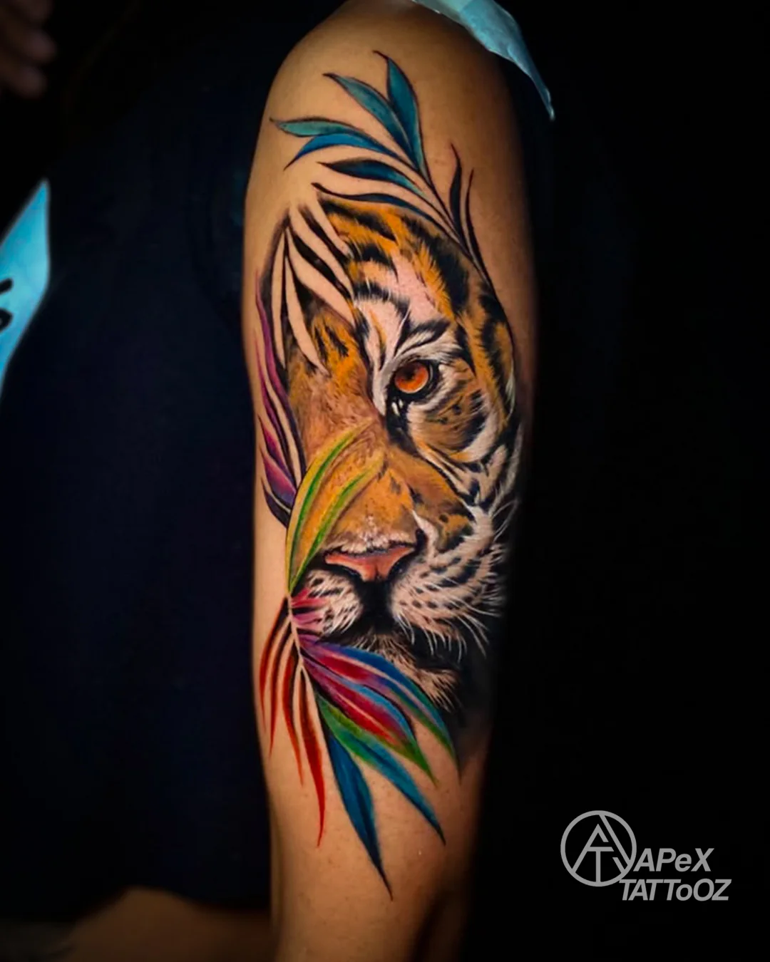
The orange face and blue areas create a clear colour relationship here. Red and green forms continue around the face, while dark stripes and pale facial details keep the tiger recognisable. Colour is spread through the composition; it is doing more than adding a single highlight.
If this is the kind of work you respond to, identify whether you like the animal’s colour, the surrounding palette, or both. A request for an orange tiger with a quiet background would lead to a different discussion from this energetic arrangement.
Black and grey can describe form and movement
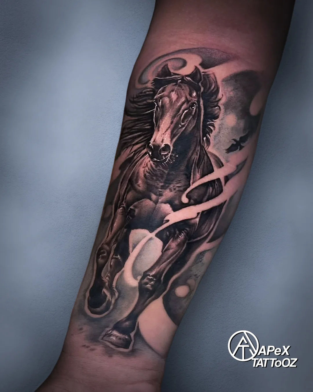
Notice the horse’s chest, face and legs, then the lighter bands cutting across the arrangement. The differences between dark areas, softer shading and open space give the body definition. A limited palette still allows a strong, active composition.
For a similar direction, explain which shapes and movement attract you. The black-and-grey realism design guide goes further into reference, contrast and texture once you have chosen that approach.
An accent can frame the main image
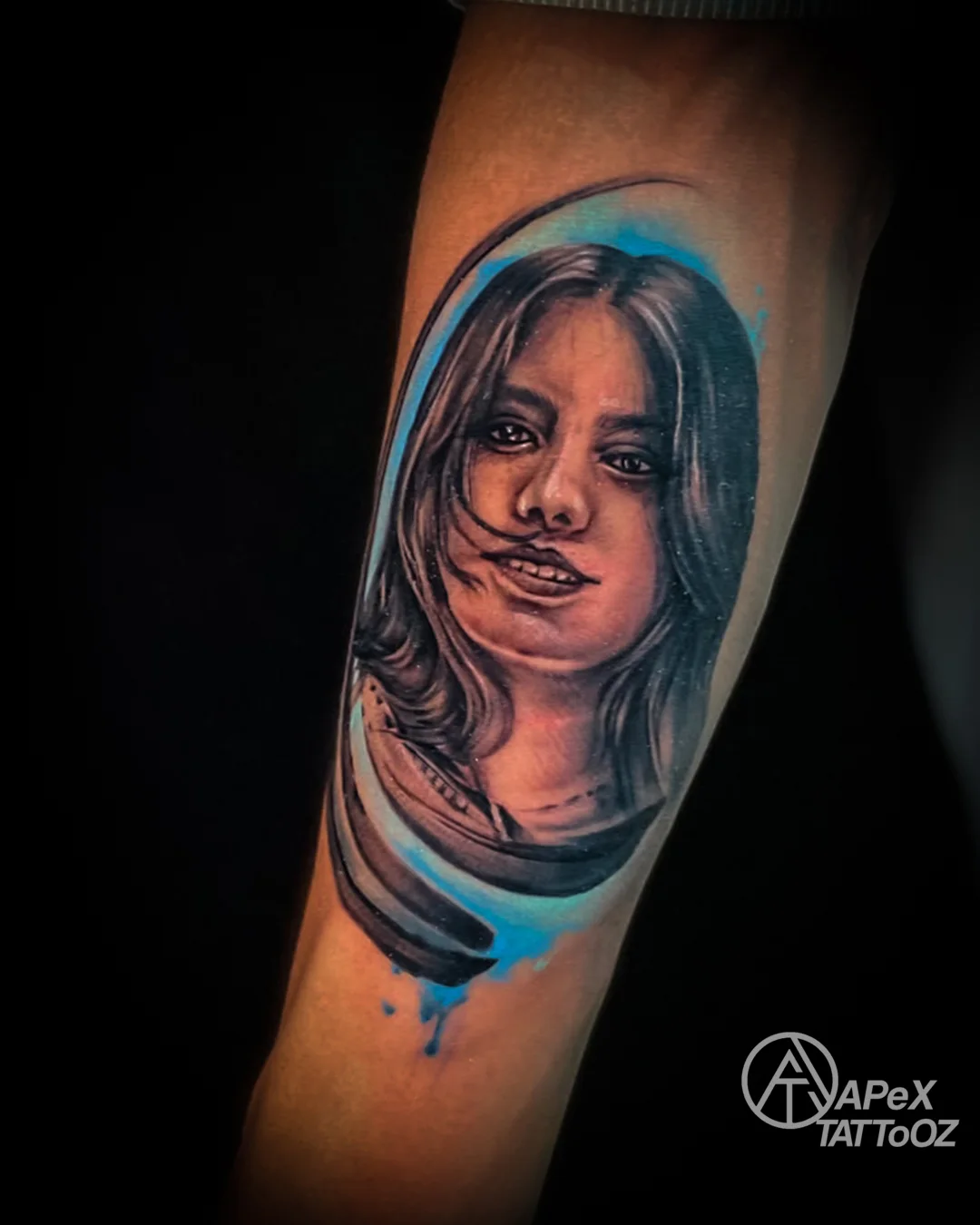
The blue sits largely around the portrait’s outer edge, while the eyes, hair and facial features carry their own light-and-dark detail. This is a useful example of assigning colour a particular place. The accent frames the face instead of colouring every part equally.
For a personal portrait, first settle which expression and reference matter to you. Our portrait reference guide explains that earlier decision. A palette choice cannot replace missing information in the photograph.
Compare the whole composition at the size you want
A small accent enlarged on a phone can look more prominent than it will within the whole tattoo. Review the complete arrangement and describe your intended dimensions using the height-and-width measurement guide. If a coloured detail matters, it needs a deliberate place in that arrangement.
Consider nearby tattoos too. You might want the new piece to share their palette, or prefer a visible change. Point out the area where the pieces will meet. Matching every colour is only one possible aim; keeping each piece distinct is another.
Use portfolio photographs to identify preferences. Lighting, camera processing and your display affect their appearance, so a screen colour is not a guarantee of an identical result on your skin. Explore the Apex tattoo gallery for other subjects and note the specific feature that attracts you.
Leave with a palette preference you can explain
Return to the botanical example. A useful preference might be: “The red flower is essential. I want it to lead, with quieter leaves and open space around the stem.” Another might be: “I care most about the curved silhouette and layered petals. I would like to explore those in black and grey.” Both give the design a direction while leaving room to develop the artwork.
Cost is a separate question about the complete project. Compare estimates for the same subject, dimensions, placement and level of detail; the Delhi tattoo price guide explains the scope factors to discuss. The palette name alone does not establish a quote.
Your next decision is small and useful: name the feature that must stay, the role you want colour to play, and one element you are happy to simplify. That gives you a reason for the palette you choose.